1. What is our current readmission rate?
Insight: Readmission Rate = 25.0%.
This is a comprehensive Business Intelligence project designed to provide executive leadership with a single source of truth for clinical quality, operational efficiency, and resource allocation. The project successfully transformed messy, siloed operational and clinical data into three highly actionable dashboards.
The organization struggled with disconnected data sources (Patients, Readmissions, Hospital Operations), which obscured the relationships between resources, process failures, and patient outcomes.
This fragmentation prevented the organization from answering two high-stakes questions:
To develop a unified, full-stack Data Analytics platform that could:
The project followed an end-to-end data analytics workflow:
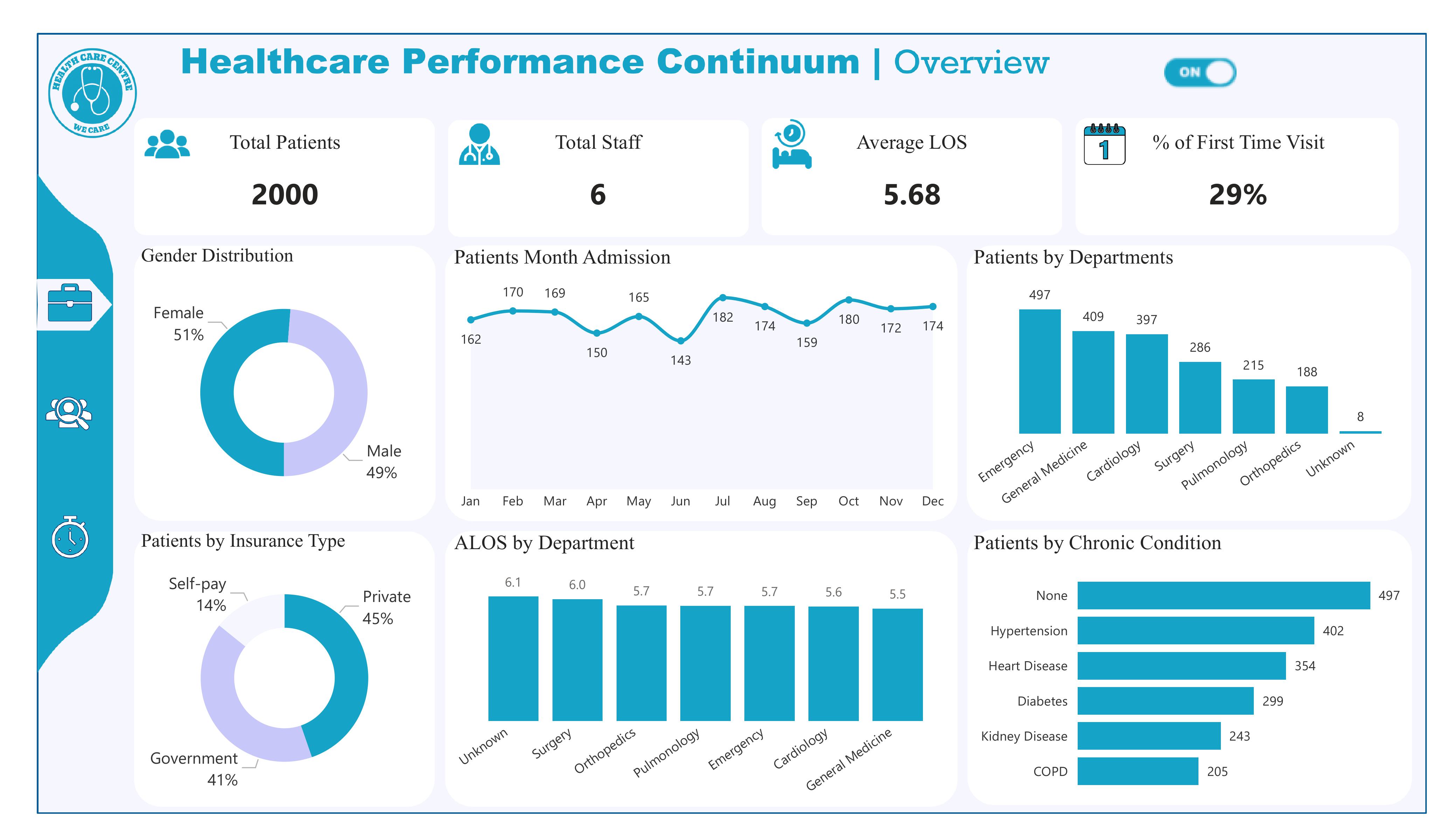
Insight: The facility served 2,000 patients over the combined 2023–2024 period. With only six staff, this reflects a consistently high workload of roughly 1,000 patients per year.
Recommendation: Hire additional clinical staff or part-timers to reduce workload pressure. Implement digital triage and appointment systems to maintain quality with growing demand.
Insight: The facility maintained a stable Average Length of Stay (ALOS) of 5.68 days across all departments. Most departments show efficient throughput between 5.5–5.7 days, while Surgery and “Unknown” categories are slightly higher.
Recommendation: Investigate surgery delays (pre-op wait, imaging time, post-op bed turnover). Standardize discharge protocols across departments. Remove or fix “Unknown” categories to improve accuracy.
Insight: 29% of all patients were first-time visitors, while 71% were returning patients. This shows strong patient trust and retention.
Recommendation: Increase outreach programs to raise first-time visits to at least 35%. Strengthen referral partnerships with clinics and pharmacies. Promote preventive checkup packages to attract new patients.
Insight: Monthly admissions show consistent patterns across both years, with peaks in July–October and dips in May–June. These trends reflect true annual cycles in patient demand.
Recommendation: Schedule more staff during high-demand months (July–October). Use low-demand months (May–June) for staff training, facility maintenance, and system upgrades.
Insight: Top departments by 2-year patient volume:
Recommendation: Add staff or rotate personnel into Emergency and General Medicine. Introduce fast-track pathways in Emergency for minor cases. Prioritize equipment upgrades for these high-demand units.
Insight: The Surgery department shows a higher ALOS of 6.0 days and the Unknown category shows6.1 days. All other departments are within the efficient range (5.5–5.7 days).
Recommendation: Analyze surgical workflow delays (OR scheduling, recovery room lag). Fix EMR categorization issues causing “Unknown” entries. Implement Lean process improvements for surgical discharge.
Insight: The payer mix is well-balanced:
Recommendation: Expand private insurance partnerships to increase high-margin patients. Streamline claims processing to avoid reimbursement delays. Offer flexible self-pay options (installments, mobile payments).
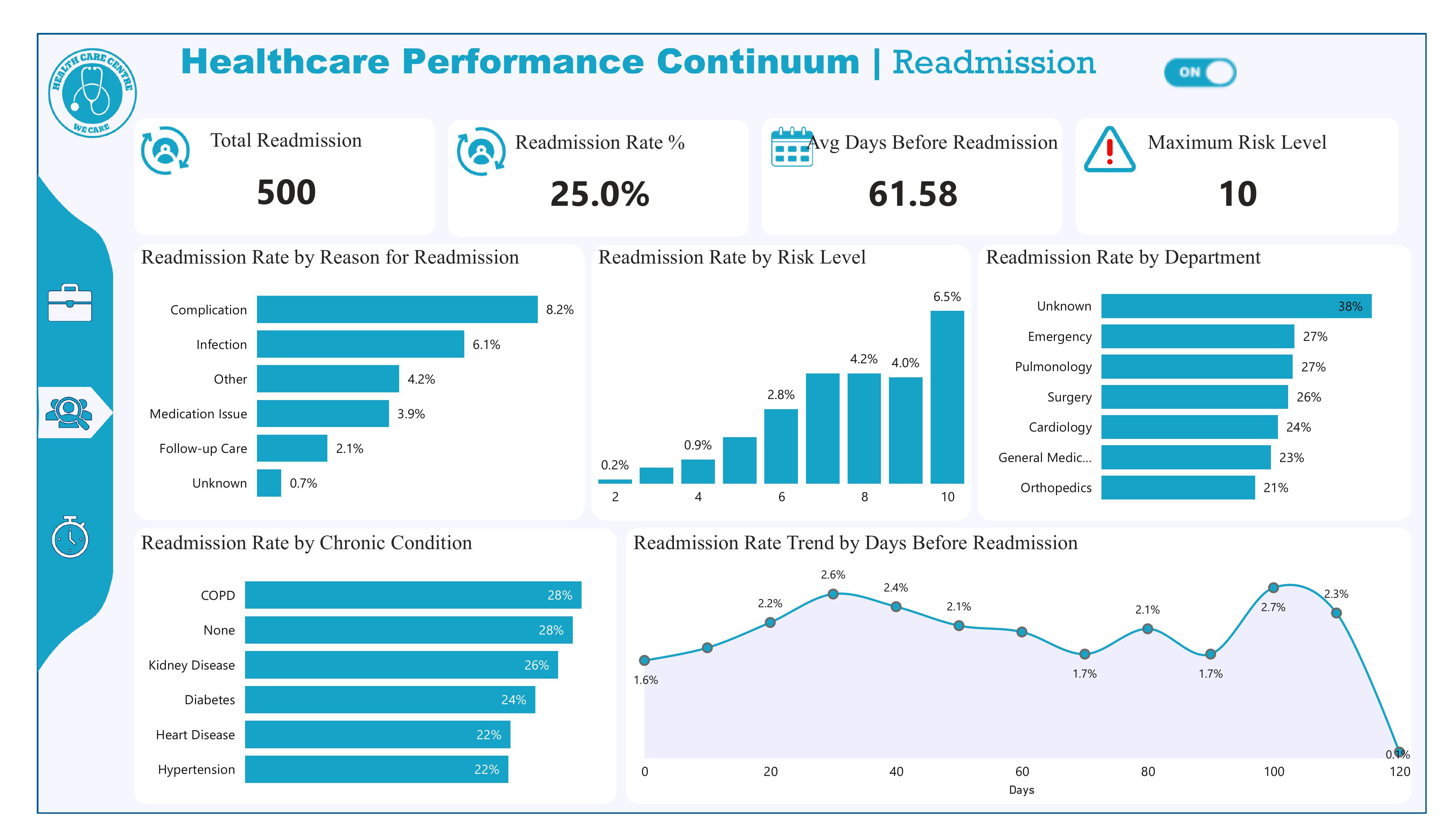
Insight: Readmission Rate = 25.0%.
Insight: Total Readmissions = 500.
Recommendation: Use the 500-count to calculate cost impact (extra bed-days × cost/day) to build the business case for prevention programs.
Insight: Average Days Before Readmission ≈ 61.58 days. The trend shows early clustering near 30–40 days plus a later spike around 100+ days.
Recommendation: Implement tiered post-discharge follow-ups (48–72 hr call, 7–30 day clinic review, 90 day check) and measure which interval reduces readmissions most.
Insight: Maximum Risk Level displayed = 10. Risk bucket 10 has the highest observed readmission proportion (~6.5% on the dashboard chart).
Recommendation: Prioritize patients scored 8–10 for intensive case management and validate/calibrate the scoring model (see Q6).
Insight: Top reasons (by %):
Recommendation: Launch targeted bundles: infection prevention (SSI bundles, antibiotic stewardship), robust medication reconciliation before discharge, and 48–72 hour follow-up calls to catch complications early.
Insight: The readmission rate increases with higher risk scores (positive correlation). Risk 10 has the highest observed readmission proportion — this suggests the tool is predictive.
Recommendation: Perform formal validation (AUC/ROC, sensitivity, precision@k). If performance is acceptable, operationalize thresholds (e.g., risk ≥8 → auto case manager assignment). If not, retrain with additional features.
Insight: By share:
Recommendation: Immediately fix EMR coding for “Unknown.” Audit discharge workflows in Emergency, Pulmonology, and Surgery (patient education, follow-up scheduling, discharge checklists).
Insight: Readmission rates by condition:
Recommendation: Create condition-specific post-discharge pathways (e.g., COPD telemonitoring, renal follow-up, diabetes coaching).
Resolve “None” classification (data quality) to know whether these are truly low-comorbidity cases or missing data.
Insight: There is a clear cluster rising up to ~30–40 days (peak ≈ 2.6%), indicating an early cluster, plus a second spike at ~100–110 days. Average is ~61.6 days but early clustering is real.
Recommendation: Prioritize early post-discharge follow-up (within 7–30 days) for high-risk patients and chronic populations.
Track readmission rates by time bins (0–7, 8–30, 31–90, 90+) to measure intervention impact.
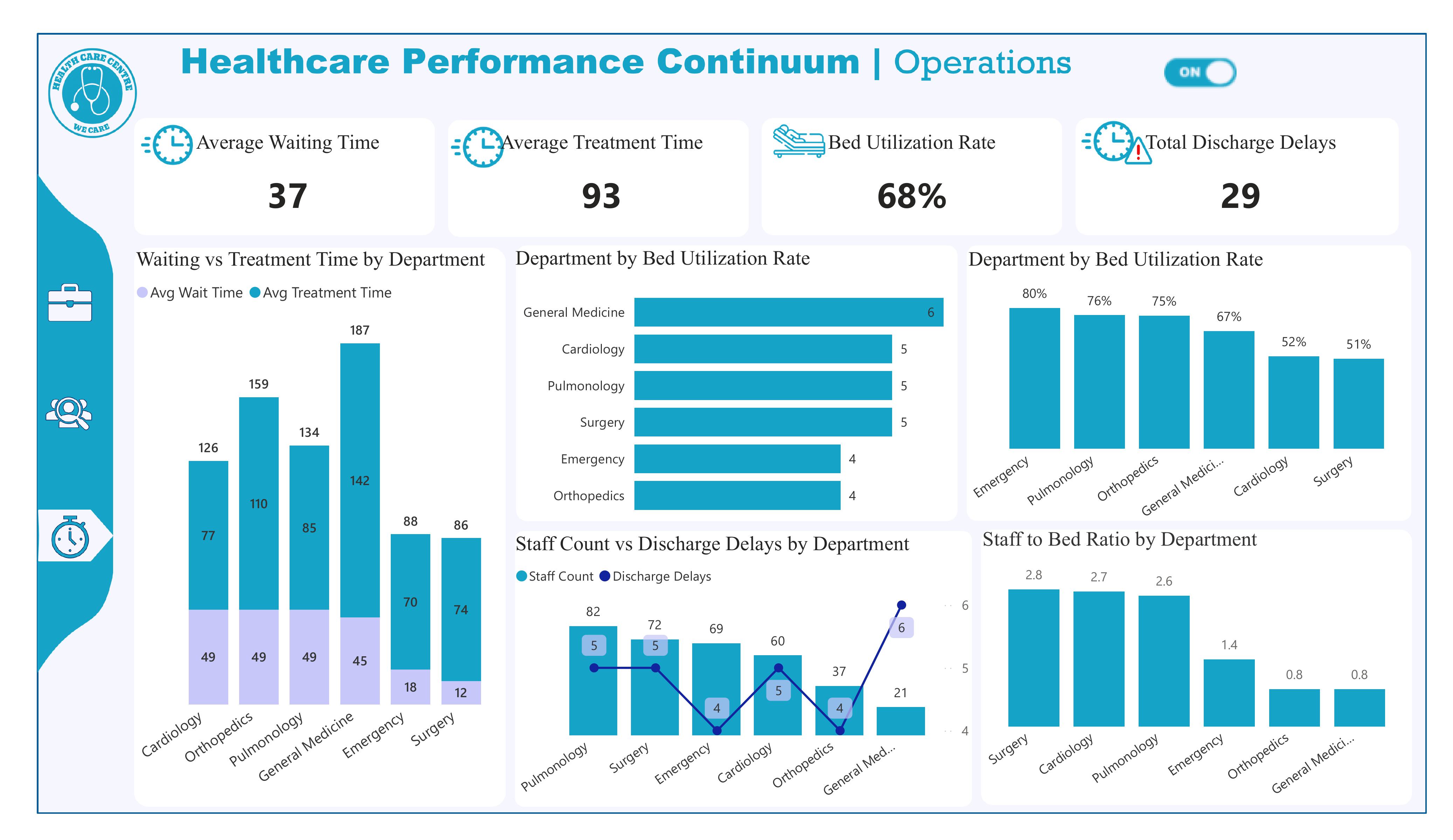
Insight: The dashboard shows an Average Waiting Time = 37 (units appear to be minutes). If your target is < 30 minutes, we are currently missing the target by ~7 minutes.
Recommendation: Implement a fast-track for minor cases, use queuing triage (digital or RN-led), and monitor wait time by hour to deploy flexible staffing during peaks. Set a short-term target to reduce to ≤30 minutes within 60–90 days and measure progress weekly.
Insight: Overall Bed Utilization Rate = 68%. This is below an overcrowding threshold like 85%, so the hospital is not at critical capacity.
Recommendation: Continue monitoring daily occupancy; 68% gives operational flexibility. However, watch department-level hotspots (next question) — localized high utilization can still cause flow issues even when the hospital-wide rate is moderate.
Insight: Total Discharge Delays = 29 (KPI on the dashboard).
Recommendation: Triage those 29 cases by cause (paperwork, transport, pharmacy hold, bed cleaning). Aim to reduce delays by 50% in 90 days using discharge coordinators, morning discharge huddles, and a digital discharge checklist to ensure meds and transport are prebooked.
Insight: Department-level bars show the highest utilization in:
Recommendation: Focus surge capacity plans and additional bed/space allocation for Emergency, Pulmonology and Orthopedics. Consider short-stay units or step-down beds to relieve pressure during peaks.
Insight: The stacked bars (Waiting vs Treatment Time) indicate departments with both elevated wait and treatment times (e.g., Emergency shows high treatment time ~187 and wait ~70), while some departments have moderate waits but long treatment (or vice versa). This suggests correlation in certain units (not uniform across the hospital).
Recommendation: For departments where wait and treatment time are both high (Emergency, Pulmonology), target clinical process improvements (triage-to-treatment workflows, rapid diagnostics). Where wait is high but treatment short, add front-line triage personnel; where treatment is long, investigate clinical throughput (diagnostics, specialist consult delays).
Insight: Staff-to-bed chart shows variance: Surgery (~2.8), Cardiology (~2.7), Pulmonology (~2.6) have higher ratios; Emergency (~1.4), Orthopedics and General Medicine (~0.8) appear lower. Some departments may be under-resourced per bed.
Recommendation: Rebalance staff allocation — consider shifting float nurses to Emergency and General Medicine during peaks. Use staff-to-bed thresholds to plan hiring: target minimum nurse-to-bed levels for high-acuity departments and pilot cross-training to fill low-ratio gaps.
Insight: The Staff Count vs Discharge Delays chart shows discharge delays concentrated in a few departments (the line markers show higher delays for departments like General Medicine and Surgery in the chart). Exact labeling suggests higher delays where staff counts are lower or processes are weak.
Recommendation: Audit discharge workflows in the named high-delay departments (start with the ones showing the highest delay markers). Implement morning discharge targets, pharmacy prioritization for discharge meds, and dedicated transport coordination.
Insight: The visual (Staff Count vs Discharge Delays) suggests a mixed relationship: some departments with higher staff counts still show several delays (indicating process issues beyond staff numbers), while others with low staff-to-bed ratios have higher delays indicating resource-driven backlog. In short — both staffing and process quality matter.
Recommendation: Combine staffing adjustments with process fixes. Run a quick correlation analysis (staff-per-bed vs delays) to quantify the relationship, then apply a two-track approach: (1) operational — reallocate or hire where staff shortages correlate strongly with delays, and (2) process — implement Lean interventions where delays persist despite adequate staffing.
To build on the findings from all three dashboards, the next phase of this project should focus on Operational Execution, Predictive Modeling, and Continuous Monitoring:
Use the insights from the dashboards to design targeted action plans:
These interventions should be piloted in the departments identified as the highest risk (Emergency, Pulmonology, Orthopedics, Cardiology).
Using the readmission dataset, develop a machine-learning model to:
Modeling tools expected: SQL for feature extraction, Python for modeling, Power BI for deployment dashboards.
Integrate the dashboards into a real-time reporting cycle so leadership can:
This can be deployed using:
• Power BI Service (auto-refresh dashboard)
• SQL Server scheduled refresh
• Optional Supabase triggers (if building internally)
Bring clinical teams, operations managers, and administrators together to:
This guarantees your recommendations lead to actual behavior change.
Enhance the dashboards with:
This turns your dashboards into a fully decision-support tool, not just a reporting tool.
Summarize everything into one operational roadmap: